Pipp
Well-Known Member
PS: I even got rid of the pink bar just for you. :tears2:


") leaseplease: And lightened up the top bar considerably. But that's it. Rest is up to the REAL designers.
leaseplease: And lightened up the top bar considerably. But that's it. Rest is up to the REAL designers. 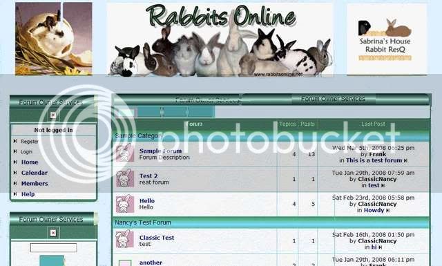


Oh, reminds me... on a serious note, I tried to use your Hotot in a heart drawing, but it pretty much disappeared when it was shrunk down that size, was going to ask if you had anything else.(Preferably with ears). (Perferably pink).Sweet - can we get a more professional looking bunny without the pink?
The forum moves so fast, few forums will have read threads, so won't be used as much. Sweet - can we get a more professional looking bunny without the pink?
Pam
Okay, I cna't decide...
solid side boxes... (except I'd rather see them with no texture, just a flat colour)
or white side boxes
pamnock wrote:Oh, reminds me... on a serious note, I tried to use your Hotot in a heart drawing, but it pretty much disappeared when it was shrunk down that size, was going to ask if you had anything else. (Preferably with ears). (Perferably pink).Sweet - can we get a more professional looking bunny without the pink?
s
You're really out to get me, aren't you? :stikpoke...maybe try experimenting with some different background colors?
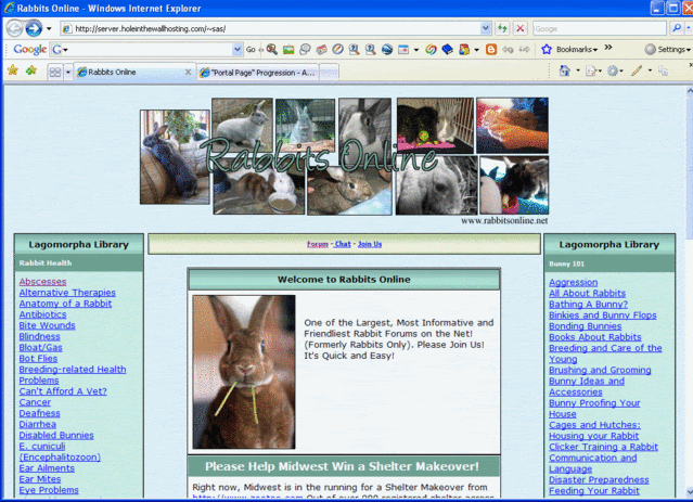
We may understand 'Hotot', but newbiessigning on may ask whya rabbit site is using a prairie dogfor an icon. :huh Enter your email address to join: