SITE DESIGN FEEDBACK (new)

Rabbits Online Forum

Help Support Rabbits Online Forum:

This site may earn a commission from merchant affiliate links, including eBay, Amazon, and others.
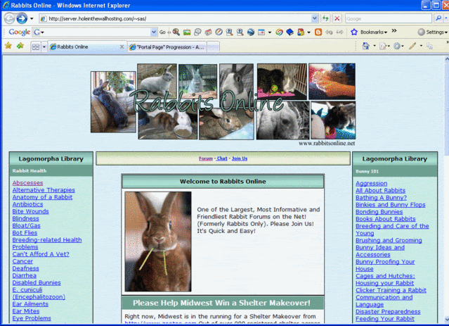
Hmm..... I was scrolling and stopped thinking to myself "oo now which is that - I really like it".......

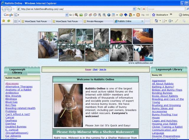
It was Pipp's repost of her colors. The blue one LOL!

Are we paying this person to do what you are doing Pipp??? :huhCause I really like what you've done so much better....
 
i really like the green ones Pipp but i am not feeling the purple part of it, it is too light to go with the green i think the purple clashes.
 
I like the changes but I'm not a fan of the blue or pink in it doesn't go with the greens. I love the textures too =) if she would just pick colors other then pink an blue i'd be happy.

I'll match the portal page to whatever the end design is!
 
pam, don't hate me!!

I LOVE THAT PAGE!!! I like the subdued darker colors. It's not as bright and I get headaches from the bright pages.

Even a tad lighter would be ok....... I just really love it!
 
Ok, so I came into this thread rather late I think.. But why are we changing things?
What's wrong with the forum as it is now?
I do like Sas's "front page" with all the library and info links, though.
 
I like the layout!!! Lots and Lots! (LOL!) Really like the Library Links!! Excellent idea. Color is OK... "Rabbits Online" could be a little bolder. Nice to see all the pictures! (It's good to see lots of bunnies on a bunny forum!)

Baby Blue background is a little too bright (intensity wise). Could be a touch lighter. LOVE the greens, very rich looking.
 
pamnock wrote:
http://server.holeinthewallhosting.com/~sas/- Wow! I like the emphasis on the library links - great idea!

I think the most recent updates of the colors are still too dark and too hard on the eyes.
Are you talking about the colours on the Portal page?

I'm surprised more people don't totally hate Nancy's latest version of the Forum page. :shock: I think we can use it for a second theme if that's the case.

s
 
I LOVE the portal page... check out that muted blue background, I almost didn't notice it. :D

Show that to Nancy. hehe.

Nad
 
Pipp wrote:
pamnock wrote:
http://server.holeinthewallhosting.com/~sas/- Wow! I like the emphasis on the library links - great idea!

I think the most recent updates of the colors are still too dark and too hard on the eyes.
Are you talking about the colours on the Portal page?

I'm surprised more people don't totally hate Nancy's latest version of the Forum page. :shock: I think we can use it for a second theme if that's the case.

s


No - I didn't mean the portal pagecolors.

Bo - I don't hate you - I'll get over it LOL

I am just thrilled to have been able to log on to the forum tonight!

Pam

 
The headers are hard to read - too dark. You either need to go with white font or, preferably, lighten up thebackground color. Take a look at some pro designs such as the yahoo.com homepage.

GET RID OF THOSE DARK COLORS! NOT USER FRIENDLY AND TOO HARD TO READ! (Yes, I am yelling)

Pam ;)
 
:shock: :? What dark colours? There are no colours at all where there is text.

This isn't the real screen, it's just the shadings, I can't do anything with the fonts or put backgrounds behind them, but that will be done of course, readablity is the most important part.But regardless, that's just the bars.

I thought you'd be yelling upa storm about the lastsolidgreen and bright blue backgroundsNancy version and nada...

I'm wondering if you're even seeing what I'm seeing??

s :?
 

Latest posts

Back
Top