SITE DESIGN FEEDBACK (new)

Rabbits Online Forum

Help Support Rabbits Online Forum:

This site may earn a commission from merchant affiliate links, including eBay, Amazon, and others.
Haley wrote:
I really like those greens, but the pink has to go- it really clashes.


Really do NOT like the pink... :vomit:
 
It's hard to visualize without the real logos, etc, up there, and my computer and software won't let me fiddle much at all, but here's an INCREDIBLY ROUGH idea of what it might look like with other banners...

changingthemebannertest.gif


The pink won't be as overstated..

PS: I couldn't change the shade of pink or otherwise fiddle with the blue/greens...

 
That's pretty nice looking. I like the colors but I think the pink needs to be paler like you say it will.
 
I have to say it because you have asked for our opinions- it's horrid . . .:vomit:

I think that combination of colors is terrible. What's wrong with the current colors?


Pam
 
I know Ive said this a million times but the pink doesnt go with that scheme. It needs to be in the pallet of the greens/blues/purple or just whitish like we have it now.

Maybe its me but the pink looks soo bad with those other colors.

I love the banner though with those colors!
 
LOL! Yeah, I didn't know how to change it to the Nadia pink/purple to see if that would work. (I have my doubts about that, too).

And Nancy says she based it on our current colours and even used a colour picker, so she's at a loss. ;)

I really would like to stick withthe blue/gray/green/teale/turquoise maybe with some with pink and grass green highlights.

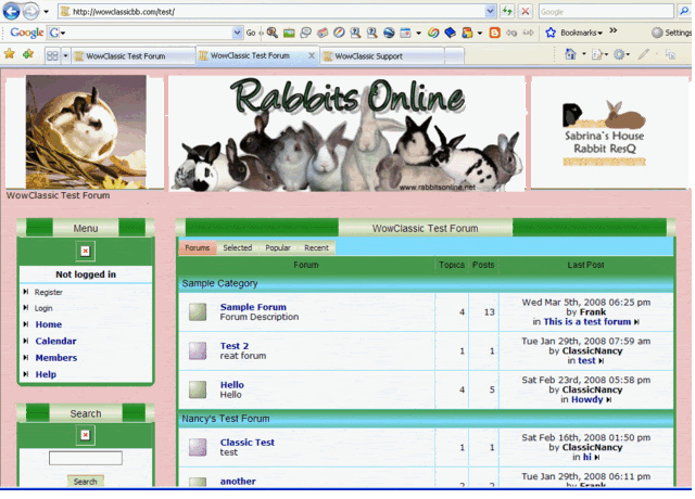
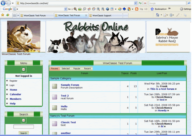
I was hoping the pink stuck in the background would act as a highlight and not a predominent, but NOT. :shock:

The other thing I want to try is her original collage idea but not as a banner, as a transparent background with the boxes and logo on top, blocking most of it, but not all of it.

Seeing as there's an upgrade, might as well reload the software onto the new server and I'll try fiddling for some examples, tho somebody's going to have to tell me how to do the main background (wher ethe pink is now) and the main border.

Stephie? Stephanie?? You around to load the software?
 
hmm, I was thinking the greyed out rose/purple color as a desperate measure if we HAD to include another color besides greens and blues, I definitely don't think it should be the background color as that will be the main color everyone sees (and purples/pinks cause too much different reactions from people in general - some hate it some love it).

The backgroundI would make the lightest, palest neutral color possible. Let the background dissapear... into the background. :) Kinda like how it is on this site - you don't even notice the background is there....


The background colour is only visible around the edges or the main page, really. The boxes, all the text bgs, etc, are separate. That's the only place it appears, isn't it?

The way Nancy had it, with the boxes a different colour, looked more stated, and to me, more interferring.

I think the current design needs a hint of solid colour somewhere. I just see all the spam pages that throw up apick of a rabbit and a bunch of text and pretend to be a website, it bugs me.

If not a bit of background colour, then the logo will have to be a lot more overt IMO. Right now we're just a touch ... wimpy. ;)
 
PS: I don't mean a solid BRIGHT colour, I think as you said a very pale greyish pinkish one would work, but I would like to see what it does in the background.
 
I just realized we have a like.... background on here. :p

Something I learned when I used to mount and mat cross-stitch I made -

The best border is a color that is already in your scheme but only used a tiny bit but doesn't take over the picture.......

So that's why this little scratchy gray background works so well here.

If we used the teal above the emoticons it would take over.......

So - we need to find a very very pale color in that scheme
 
PIPP I absolutely LOVE that last one! Enough blue to make it Pop but not too much to make us Puke!


I agree, the last one is MUCH better! The hint of blue is not over powering yet it is enough to make the Forum boxes pop out.
 

Latest posts

Back
Top